

Tote bag is a common shopping bag, and the patterns and words printed on its surface are important means of brand promotion and product promotion. Anti-color composition design is one of the commonly used design techniques in handbag printing, which can make the pattern of handbag more eye-catching and prominent, attract the attention of consumers, and improve the popularity and sales of products.
What is anti-color composition design?
Anti-color composition design refers to the use of opposite color combinations in handbag printing to form patterns and words, so as to achieve a strong visual impact. For example, black and white anti-color composition is often used in handbag printing. Black patterns and words are printed on a white background, and white patterns and words are printed on a black background. This design method is both simple and practical.
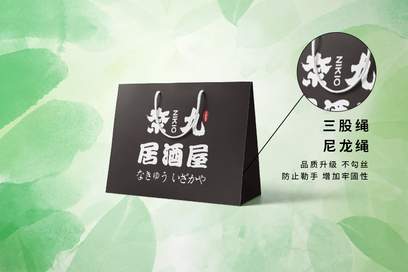
Advantages of anti-color composition design
Strong visual impact
The anti-color composition design adopts the opposite color combination, which makes the patterns and words more prominent and eye-catching, causing people's visual impact, thus improving the popularity and sales of products.
Simple and easy operation
The anti-color composition design does not need complicated graphic design and color composition, but only needs to reverse the colors of patterns and characters on the basis of the original design to realize the anti-color composition design, which greatly reduces the printing cost and production difficulty.
Wide range of applications
The reverse color composition design is suitable for all types of tote bags, whether it is commercial shopping bags, gift bags, or environmental protection bags, cultural bags, as long as the reverse color composition design is adopted, it can make the tote bags more prominent and attractive.
Precautions for anti-color composition design
Choose the right color
Anti-color composition design should choose a suitable color combination, and avoid using too bright or dim colors, so as not to affect the visual effect.
Pay attention to printing quality
The printing of handbags with anti-color composition design should pay attention to the printing quality to avoid problems such as uneven colors or color deviations, which will affect the visual effect.
Consider the size ratio of patterns and text
The size ratio of the pattern and text of the anti-color composition design should be coordinated, and there should be no situation that the pattern is too big, the text is too small, the pattern is too small, and the text is too big, so as not to affect the visual effect and reading experience.
Application of Reverse Color Composition Design in Handbag Printing
The anti-color composition design in handbag printing can make the patterns and words more eye-catching and prominent, and improve the popularity and sales volume of products. Here are some examples of reverse color composition design in handbag printing :
Commercial shopping bags
Commercial shopping bag is a common type of tote bag, and the reverse color composition design can make the pattern and text of commercial shopping bag more prominent, more attractive, and improve brand awareness and sales volume.
Gift Bag
Gift bag is a high-grade tote bag type, and the anti-color composition design can make the pattern and text of the gift bag more elegant and exquisite, and enhance the gift feeling and quality of the gift bag.
Environmental Protection Bag
Environmental protection bag is a type of tote bag that pays attention to environmental protection and sustainable development. The anti-color composition design can make the environmental protection bag more prominent and eye-catching, and improve the usage rate and environmental awareness of environmental protection bag.
In short, anti-color composition design is a simple and practical Tote bag printingDesign techniques can make handbags more prominent and eye-catching, and improve the popularity and sales volume of products. When applying anti-color composition design in handbag printing, we should pay attention to choosing suitable colors, paying attention to printing quality and considering the size ratio of patterns and characters to achieve the best visual effect and reading experience.