

Many people are very interested in the design and printing of kraft paper bags, especially those colorful kraft paper bags with colors. If the printing process is relatively good, it can play a very good external publicity effect, thus getting widespread attention from more consumers. However, because the printing process of colored kraft paper bags is relatively complicated, it is necessary for everyone to fully understand the relevant content. Next, I will introduce the relevant content in detail.
Colorful Kraft Paper Bags-Design of Colors
If you want to design and print a gypsophila color kraft paper bag, because the colors of gypsophila are relatively rich, it is necessary to design the color of the kraft paper bag. It is necessary to make corresponding design according to the actual situation, understand the actual color of gypsophila, form a good contrast, and avoid the phenomenon that the color gap between kraft paper bags and gypsophila is too large, so that it is difficult to package a good gypsophila bouquet, and it will not be able to achieve the ideal publicity effect.
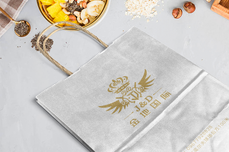
Colored kraft paper bags-pay attention to the color difference during printing
Many people may not know much about the printing of kraft paper bags. The printing of kraft paper bags is relatively simple, but everyone needs to pay attention to the color difference in the printing process. Since the color seen on the computer screen is slightly different from the actual color, there may be some color aberration in the printed color, and the color aberration can be maintained within a certain range. In order to avoid large quantities of color differences, if you want to print a certain number of colorful gypsophila kraft paper bags, you can take the lead in proofing and then adjust them according to the actual colors, so that you can have a very good printing result.
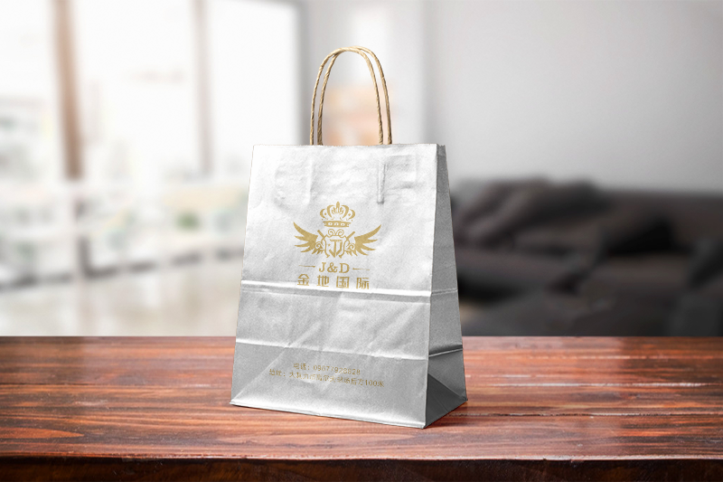
Colorful Kraft Paper Bags-Choice of Colors
Although gypsophila bouquets have many different colors in our lives, such as blue, yellow, etc., when printing colored kraft tape, we should also pay attention to some color matching. For example, blue should not be matched with red, which will reduce the visual effect of consumers. If you can't achieve the corresponding external publicity effect, you need to make corresponding choices according to your actual situation, so as to choose a color matching scheme that suits you.
Through the above more detailed introduction, we should be rightPrinting of Colorful Kraft Paper Bags With a certain understanding of the work, the demand for color is actually not great. You need to be able to compare and print according to the above methods, so that you can have a very good printing result and play a good role in external publicity.